Summary
This article covers how to manage multiple device form layouts.
The Datatrak Direct mobile app takes a clinical trial beyond the computer screen. When building forms and surveys for a study, as a form builder, it's tough to create a form that looks good on the various screen sizes that might view it later.
Fortunately, forms created in Datatrak Direct can easily be made to display well on multiple device types and screen sizes. This gives form builders the most detailed control over form layout across the various devices that users of the study will be entering forms on. For example, a physically wide form that looks good on the web, when opened on a mobile phone via the Datatrak Direct app, would run off the screen forcing the user to scroll horizontally back and forth to see the entire form, which would make for poor user experience.
Due to the complexity of case report forms in clinical trials, Datatrak Direct provides an automated tool for study builders to take a form they've built and rapidly set it up for multiple devices, and still maintain a streamlined dataset in the end.
The steps below outline how to target form layout for multiple devices. These steps only apply to study builders.
1. Ensure you have access to the Device Dictionary within the Host Configuration menu on the app. If you don't see it, contact support@datatrak.com to have it enabled.

2. Setup the device target sizes or PDFs that will be needed in the study.
It's okay if you are not sure about which screen sizes to target, especially for ePRO studies where subjects use their own devices. Having 3-5 targeted sizes for a range of devices is sufficient.
When defining the screen width value of different devices, Datatrak Direct uses what is called UIKit sizes (or points), based on pixel mapping used by iOS. You can read more here on that.
If a form is being opened on a device with a screen width size not specifically targeted in the study, the system will open the form in the next smallest size that it can find.
For example, in the list below, if a user opens a form on a device with a screen width between 400 units wide, the system will open the form on the 375 size, which only means the form won't be utilizing the full width of the screen. With that said, it's good practice to target one common small device to meet the lowest common denominator.
If the system does not have the next smallest device being targeted, it will open the main form size, and the user will need to scroll horizontally to see the entire form if the form was built wider than the screen of the device it's being viewed on. Read more below about the main form.
Language: specific devices can also be targeted, whereby the form will open based on the user's device-level language settings. For example, If a French user has their device settings in the French language, and the study they are doing data entry on has a form targeted to French, the user will see that version of the form. Any data variable queries will also be presented in the device language, but the query text itself in the queries report will be stored in English.
Lastly, the device type "PDF" can be used to create paper versions of the electronic forms. This version will never be displayed to end-users. Instead, it's specifically a tool for form builders to create paper CRFs for printing.
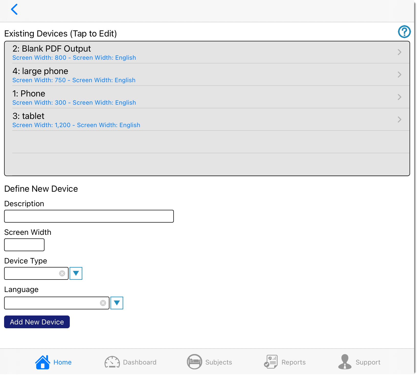
Now you have a list of targeted device sizes that can be used on any study within the host account.
3. In the form manager, open a form that you would like to target for various screen sizes. Then open the form properties for that form (highlighted below).
Important Point: The form you are opening is referred to as the Parent form. It's best if this form is originally built on the web so that the web version of the form displays well on that platform and remains untouched by the more expanded functions the Datatrak Direct builder provides.
In this step, you are merely taking that parent form and creating a mobile/child form from it, which you will use to make layout and field size changes.
4. Scroll to the bottom of the form properties and select a device to target. The list of options is the one from step 2 above. There is also an option to force the layout into a single column if desired. Depending on the screen width and current form layout, this may happen anyway.
Then tap the Build Device Form button.

In the background, the system will instantaneously re-arrange the form layout to fit the device width being targeted. The new form referred to as a child form, that was created can be accessed in the Form Manager screen. It will have the same name as the parent form followed by a number. You will also see a description of the device it's targeted for.

5. Open the child form in the forms list
6. Review the layout that was generated by the system, move items around as desired, and save the changes.
Important: Do not change any of the fields, add fields, or delete fields on a child form. If a change must be made to something other than the layout or field sizes, make the change on the parent form and then re-create the targeted form.At any time, you can open the form managers list of forms and easily differentiate between parent and child forms.
Child forms are simply a re-arranged version of the main/parent form.
IF changes need to be made to the content of a form - such as adding edit checks, or changing questions, delete the child forms associated with that form, make the changes in the parent form, and repeat the steps above to quickly re-create the child forms.
Need more help?
 Please visit the Datatrak Contact Information page.